Guide to CSS filters
If you’re a web developer, then for one reason or another you’ve probably put your hands (like I have) on image editing software like Photoshop. Also, you’ve probably used the filter menu, which lets you give a layer cool effects such as blur or overlays, and gives you control of contrast, saturation, etc. Well, fear not! Enter CSS filters and say goodbye to the longest minutes of requesting work from our fellow designers: do it yourself! Unlock the powers of the CSS filter property and show the world some magic.
The totally awesome CSS filter property has been around for a while already. Full support was first included in Chrome 18 (March 2012). Firefox adopted it early in version 3.6 but only achieved full support in Firefox 36 (January 2015). A little bit later on, Opera and Safari added support, and nowadays you can use it on most browsers, including the Android native app. Of course, with the exception of cough Internet Explorer (no support) and Microsoft Edge, which includes partial support.
Before actually explaining what any of this does, I’d like to show you a little piece of code I’ve written to let you play around with filters. Go ahead, frolic away:
The resulting CSS will appear here.
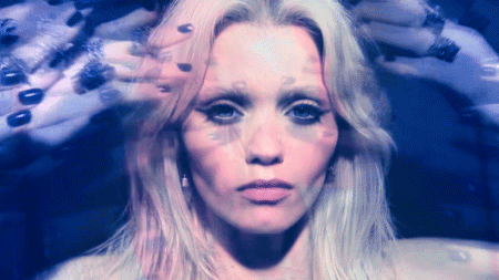
As you can see, there’s a million things you can do with the CSS filter property. If you haven’t yet, try using a GIF with it. For the lazy ones, here’s a link to a very cool one by Elle Muliarchyk.
CSS filter FAQ #
Most of these effects are self-explanatory. But there are some things which may cause a little bit of head scratching. Here’s my attempt at guessing what those are:
Why would I use an opacity filter when I can just use the good old opacity property? #
img {
  /* A filter... **/
  filter: opacity(50%);
  /* Or normal opacity... **/
  opacity: 0.5;
}
These two will yield the exact same visual effect. But most modern browsers use hardware acceleration on filters, which improves the performance of opacity filters relative to that of the regular opacity CSS property.
What is hue-rotate? What the hell does it do to my element? #
I’ve based this information on this Wikipedia article. Hue is one of the properties of a color. It is described by the CIECAM02 model as “the degree to which a stimulus can be described as similar to or different from stimuli that are described as red, green, blue, and yellow”. Hue is to a color what timbre is to a sound, basically. Each one of the colors in our HTML element can be located (and represented by a degree) on this scale:
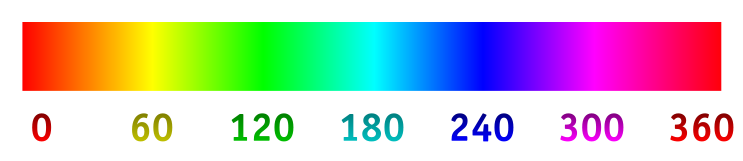
When you use, for example:
filter: hue-rotate(20deg);
…you shift every single one of the colors in your HTML element 20 degrees to the right in the scale up there. CSS uses a little bit of a more rudimentary scale though, so what you get is an approximation.
Hue is a cyclical property. Use my filter generator and apply a 360 degree hue-rotate. You’ll see you get the exact same result with a 0 degree hue-rotate, or with no filter at all.
Which different units should I be using with each filter? #
For blur, you use pixels. With blur, every pixel is analyzed and the surrounding pixels up to a distance specified by you with:
filter: blur(20px);
…are blended together to create the blur effect.
For hue-rotate, you use degrees. This has already been explained in the last section. For the rest of the filters you use percentages.
More effects Vol. I: drop-shadow #
There are two more functions you can do with the CSS filter property other than the ones I’ve included in my little program up there. One of them is an effect very similar to box-shadow. It’s called drop-shadow and the syntax goes as follows:
img {
  filter: drop-shadow(16px 16px 10px grey);
}
The values stand for h-shadow v-shadow blur spread color, and the result of the example up there is:

But what is the difference between drop-shadow and box-shadow? #
Here’s a visual example. That’s the drop-shadow filter on the left and the box-shadow property on the right, on the same image. As you can see, the filter respects the alpha layer on your PNG while the box-shadow property applies the effect on the limits of the canvas. If you were to give an element with a drop-shadow filter a pseudo-element such as :after or :before, the filter would respect that, too.

For a more in-detail comparison, I’m going to link you to a great article by the new code: box-shadow property vs. drop-shadow filter: a complete comparison.
More effects Vol. II: SVG filters #
The filters directly available with CSS are no more than a bunch of presets built on top of different definitions of SVG filters (which are essentially XML data). Building these specific filters from zero whenever you wanted to add them would be a PITA, so some awesome people at W3C packed up the presumably more popular filters and created the filter property. This does mean though, that you can still add your own home-brewed SVG filters with the following syntax:
img {
  filter: url(#);
}
You can reference on-page anchors by giving your filter an ID and then using that as the URL. If you’d like to go more in-depth on how to create your own filters, check out this article.