CSS features that Firefox supports but Chrome doesn't
This is a short list of CSS features that work on Firefox but not yet on Chrome. In particular, features that would be really cool to use in production if the other major browsers supported them. Maybe you didn’t know about some of these. Hopefully, I’ll get you informed on them. I’ll update this when the glorious day comes in which we are able to use these without polyfills or any other kind of external libraries.
Scroll snap points #
Scroll snap points, in case you haven’t heard of them yet, are a way of introducing precision while scrolling. They’re especially useful for touch devices. Imagine a gallery of images arranged horizontally: a user on a tablet might swipe upwards to continue towards the next image, but the browser scrolls wildly towards the southern ranges of the website. With scroll snap points, we can tell the browser to gracefully stop scrolling in certain points of our document.
There are some cool libraries which implement this with cross-browser compatibility, such as the ever-famous pagePiling.js (which does a lot more things than just scroll snapping), but the native CSS property doesn’t work on Chrome.
CSS scroll snap points work for the horizontal axis as well as for the vertical axis. I’m going to give you an example of a vertical scrolling container with scroll snap points.
Update from 2026: when I wrote this in 2016, the code below used the original scroll snap draft (
scroll-snap-points-yandscroll-snap-destination), which only Firefox shipped. That draft was scrapped, and Firefox removed it in version 68. The properties no longer exist in any browser, so the original example stopped working everywhere. I’ve updated the demo and the snippet to the current CSS Scroll Snap Module Level 1, which all browsers support today.
Scroll me, this snaps in any browser now
For a great guide on how to use this, refer to CSS Tricks. The basic syntax you have to use for this is as follows:
.container {
  scroll-snap-type: y mandatory;
  overflow: auto;
}

.container > * {
  scroll-snap-align: start;
}
Hyphenation #
Next up in our CSS features that don’t work on Chrome is hyphenation. Check out this piece of lorem. The upper picture was taken on Chrome, and the lower one was taken on Firefox. They both have hyphenation active, but obviously it only works on Firefox.
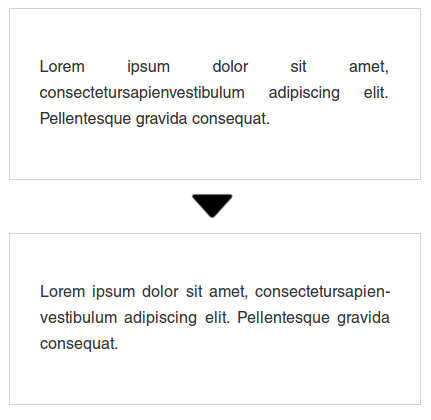
The hyphens property is tied to the language attribute you give your HTML, so be sure to use the correct language. Here is the different syntax options you can use in more detail:
.element-that-contains-text {
  hyphens: none;
  hyphens: manual;
  hyphens: auto;
  /** And as usual... **/
  hyphens: inherit;
  hyphens: initial;
  hyphens: unset;
}
Normally you’d use auto. But the manual option is quite interesting (although not very practical, I think). On manual you’d be able to suggest a line break. This can be done in two different ways: by typing a hyphen (-), which suggests the line break but prints the hyphen even if there’s not going to be a line break, or by adding a soft hyphen (U 00AD). A soft hyphen won’t print but will break the line if able to.
I have recently been informed by a tweet by Michael Scharnagl of a plan to introduce hyphens to Blink, which is interesting. Let’s hope it comes to Chrome soon.
The element function #
This feature is awesome! Its effect is a little bit difficult to pick up on. Here’s my attempt at explaining it. The CSS background property accepts several different values, such as colors and image URLs. In Firefox, you can also use the element() function as a value for the background property. Let’s set up two div elements with some simple markup:
<div id='element-on-the-left'>
  <!-- whatever content here, this will be
  the source for the element() function -->
</div>

<div id='element-on-the-right'>
  <!-- here we will print a background
  with element() and it will be awesome -->
</div>
Next, we will use this markup to generate a live image of the element on the left. This image will be then used as a background for the element on the right, and the markup goes like this:
#element-on-the-right {
  /** Set whatever size here and... **/
  background: -moz-element(#element-on-the-left);
}
The whole thing will end up looking similar to this (here’s a link to codepen.io which obviously only works on Firefox):
Now, at first I thought this was cool, but not extremely useful. Until I saw this post by Vincent de Oliveira. His ideas using this feature are extensive and really nice! Go check it out.
Sticky positioning #
Update: This has been added to Chrome in version 56. Hurray!
No idea how this one went past my sight for the original list. Thanks to reddit user Graftak9000, Geoffrey Crofte and Nathan here in the comments for pointing this one out.
Scroll down. This will work on Firefox and (now) Chrome 56
This sticks to the specified 'top' value without any JS.
This property value solves the issue that many modern websites using as sticky header have. Nowadays, cross-browser implementations of a sticky header (or sidebar, or whatever) effect include JavaScript in one way or another. Elements with this property will behave as a relative positioned element until it reaches a threshold specified by its top property, at which point it will behave as a fixed position element. I guess the demo up there is self-explanatory. Here’s the syntax for sticky elements:
.element {
  position: sticky;
  top: /** Your value **/;
}
Recent versions of Safari also support this but don’t work properly when the parent has overflow: auto; specified. My demo will not work on Safari because it doesn’t include the -webkit- vendor prefix and because it uses said overflow property. Support on Chrome was enabled with a flag on versions 23 through 26 but it was dropped later on. A new implementation is in development, though, so hurray!